I used Google's Blogger platform to create the Ways 2 Interface blog as I had prior experience with using Blogger to create my Something to do with Film and EYES of a Storyteller blogs.
The original name for the blog and research project was originally Ways of Interfacing to better match with its precursor Ways of Being: The Spectator and the Spectacle.
But I very quickly changed it to Ways 2 Interface which was much more punchier and, with the inclusion of ‘2’ in the name, stylistically conveyed that it was the second phase of the research I was undertaking.
I always envisioned Ways 2 Interface, a more widely media focused blog, being a sister blog to Something to do with Film, my much more specific film focused blog that I started in 2011 when I was studying my BA (Hons).

I also saw it as being an extension of my EYES of a Storyteller blog which I had brought to a conclusion in 2013.

To this end, I adopted the same blog layout from my Something to do with Film and EYES of a Storyteller blogs for use with Ways 2 Interface.

So I instead went back to using the same in-house Blogger blog skins I had used for Something to do with Film and EYES of a Storyteller.

For the Ways 2 Interface layout, I widened the right side panel to better accommodate the content and widgets I placed there.
I also inverted the colour of the background of the blog posts panel to further differentiate it from the two previous blogs.
But comparing it to the design of the Something to do with Film blog and EYES of a Storyteller blogs, there are clear similarities in layout with all blogs plainly being related to one-another.
The background image of the blog is the old power circuit board I removed from my television and replaced with a non-faulty one.


Originally I utilised the full colour image of the circuit board, but later changed it to monochrome so as to make it less distracting and impactful on the content on the pain panels of the blog.
The next clear distinction was the design of the banner image which would serve as the main brand identity for Ways 2 Interface.
With the banner images for Something to do with Film and EYES of a Storyteller, I aimed to keep their designs as visual and immediately discernable as possible.


Granted, there is text present on both of the previous two banners, but I only ever put as much as I felt was necessary for introducing the basic concept of each blog.
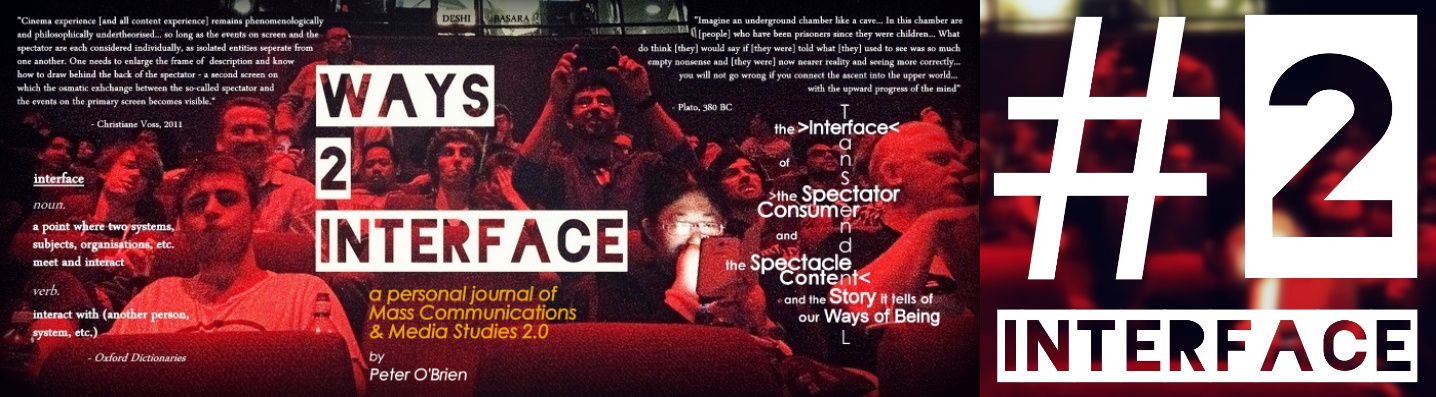
But for the Ways 2 Interface blog, I wanted the banner image to be heavy on text and information
I wanted a banner image that would quite literally be a heads up display to play into blog’s reflexive nature and essential concept of ‘the interface’.

The image I started with was a photograph I took at the BFI IMAX in 2013 while myself and the rest of the audience were waiting for The Dark Knight Trilogy all-nighter to begin.
 |
| BFI IMAX - Looking up to the projection room |
I didn’t originally take this photo because I planned to eventually use it for the branding of a blog.
Rather, I took it because I wanted to visually document the vast size of the BFI IMAX – the biggest cinema screen in the UK – which is almost impossible to do without a very wide-angle lens.
 |
| BFI IMAX - Looking towards the screen, I couldn't even get all the screen in the photo |
 |
| 1st version |
However I went with the photo of the audience in the BFI IMAX mainly because…
- The IMAX medium and the BFI IMAX were two inspirations for Ways of Being, my dissertation precursor to Ways 2 Interface
- The image contained a number of different interfaces and points of view, i.e. people using their smartphones, one person taking an picture with their smartphone, various people staring directly into my lens, other people looking elsewhere, some people are wearing glasses which act as an interface between them and the external world, there is the interface of the projection room window.
- The dominant red glow of the image reminded me of the heads up display from the Terminator movies, which itself is another form of interface and was an aesthetic I wanted to replicate in the blog banner.
 |
| Terminator HUD from Terminator 2: Judgement Day |
The blog banner changed a couple of times mainly from where I would add more text information to it or would adjust the information therein.
 |
| 2nd version |
The final form it took occurred when I decided to transition Ways 2 Interface away from being a research project in its own right and more of a study log and personal journal.
|
| 3rd version |
As I was also experimenting with social media at the time and planned to explore the interfacing natures of social media as part of the research project, I also created a hashtag specifically for the blog.

I did create a Twitter account specifically for Ways 2 Interface on which I routinely used the #2interface hashtag.
But the @ways2interface Twitter account didn’t really go anywhere so I eventually deleted the account and instead focused all my marketing efforts on my personal social media accounts.
I had also planned on creating various additional info images to visually present aspects of the research I was undertaking, but never got beyond the one below.

The Ways 2 Interface blog also originally had its own URL – www.ways2interface.com – which I purchased.
I also purchased the similar www.waystointerface.com URL and set it up as a redirect to ways2interface.com because I worried that if someone was typing in the name (which is very rare these days) they would type ‘to’ opposed to ‘2’.
I discontinued using the paid for URLs when my focus shifted from Ways 2 Interface over to what ended up becoming ibuiltmyown.education a.k.a. my MTA Portfolio.
Then I reverted back to using the free blogger URL www.ways2interface.blogpsot.com which is why a lot of the hyperlinks in the pages and posts of the blog no longer work because they’re still set to the ways2interface.com URL.
No comments:
Post a Comment